VISUAL DESIGN
SOCIAL MEDIA


P.O.S.T.E.R
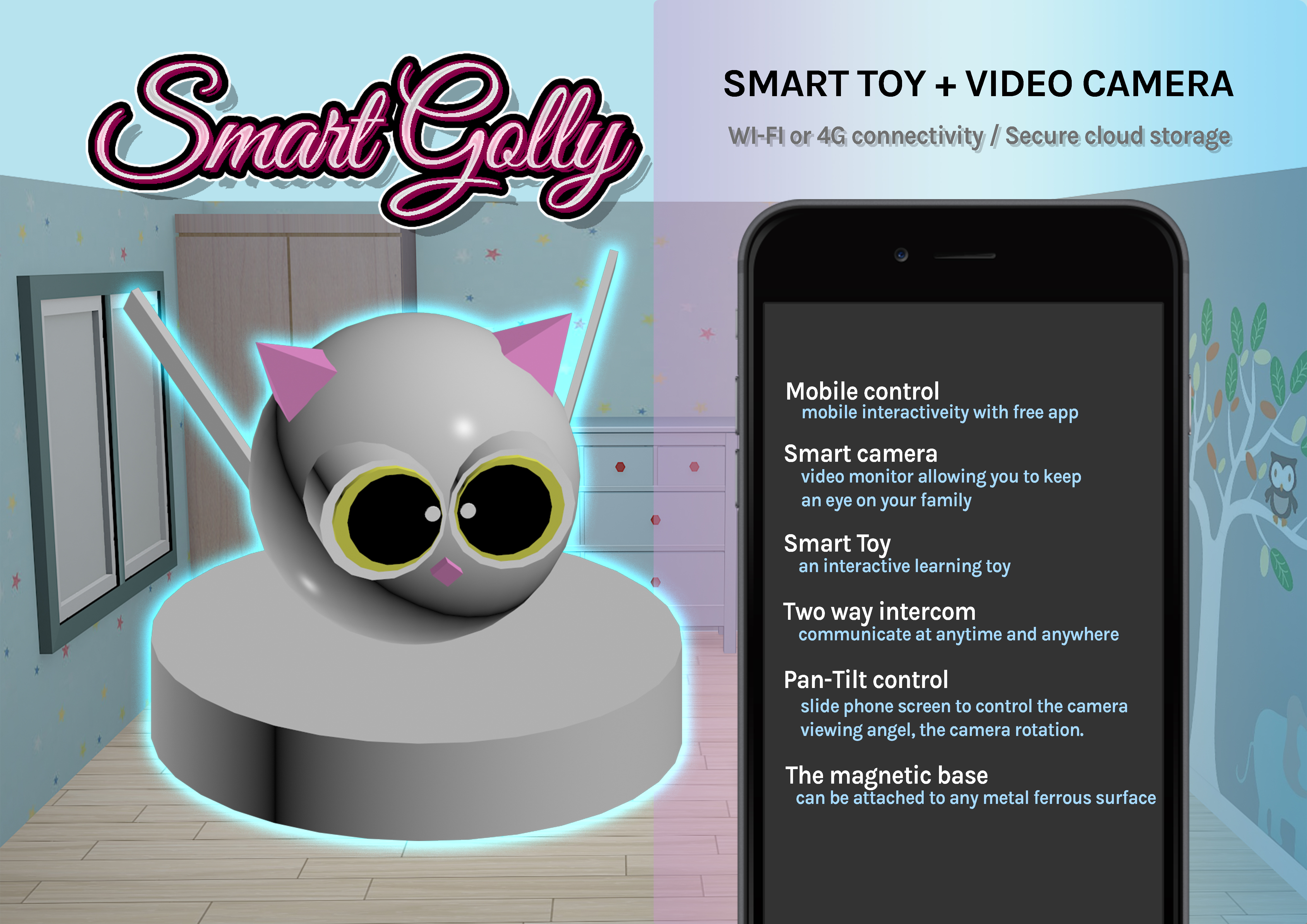
- Poster purpose: Promote Smart toy + Video camera to target user
- Target audience: Parents
- Color scheme: light blue, grey and light pink
- Emphasize the mobile control and adorable smart toy
- Short and precise titles allow user understand main functions easily
- Outer glow effect to convey the theme and innovative of the product
- 3D Background of bedroom envoirment to convey where the product could be use
- Design tools: 3D Max for the toy, Unity for the room enviorment, and Photoshop for image editing
B.A.N.N.E.R
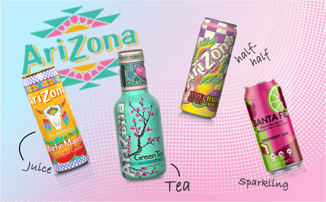
- Banner purpose: Promote drink brand to retailer customers
- Target audience: B2B Customers
- Color scheme: light green and pink
- Arizona Green Tea is well known in Australia because it is selling by Woolworth. But consumers are not familar with other kind of products from this brand such as juice, half-half and sparking. The aim of this banner is to introduce all kind of products that the wholesaler is providing. I put the popular green tea bottle in the middle and the logo on the top-left to attract the audience's attention and lead them to know about other new products.
- Use handwritten fonts to highlight product introductions as some consumers may feel confused about the products.
- This design style: energetic and young
A.D.S
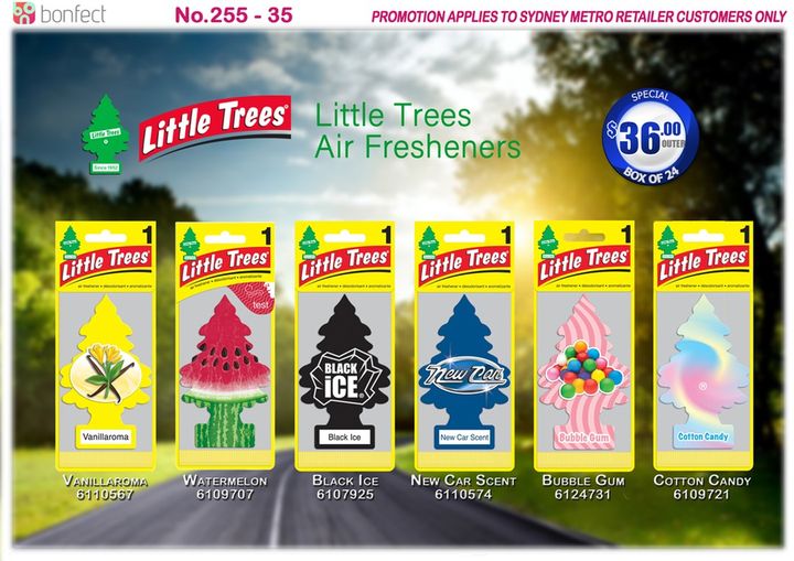
- Product: Car Air Fresheners
- Target audience: B2B Customers
- Color scheme: green, blue and brown
- As this is a product use inside the car, I choosed a picture of a landscape full of trees and sunlight outside the car screen, which is reminiscent of fresh and natural air
- The description under the items to allow customers know the products name and codes accordingly
A.D.S
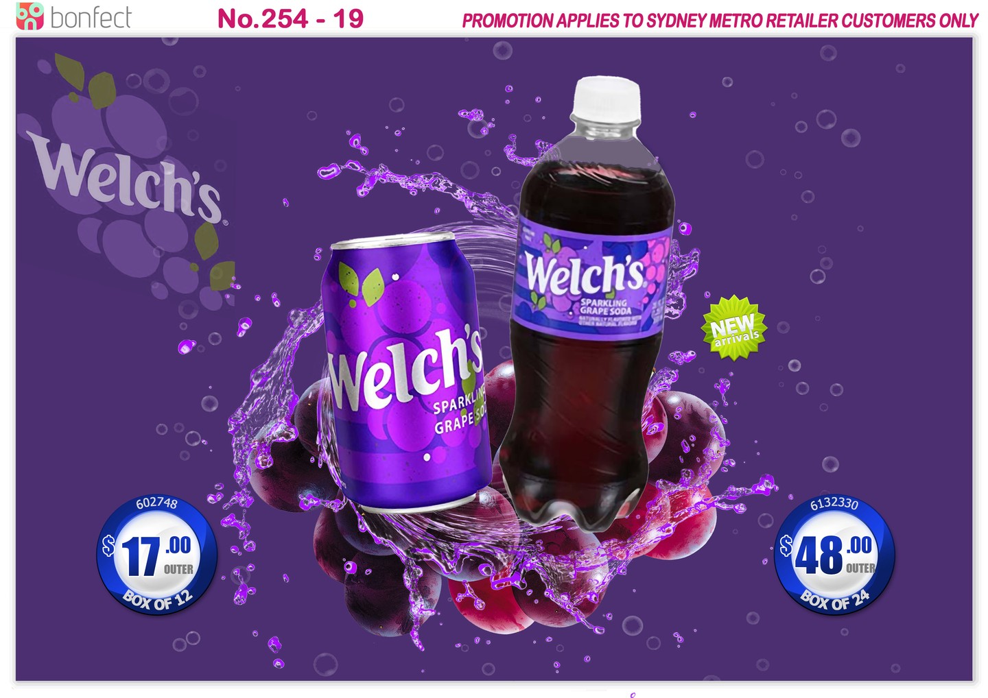
- Product: Sparking Grape Soda drink bottle and can
- Target audience: B2B Customers
- Color scheme: Purple and white
- Put both can and bottle on the ads to tell the audience it selling two different packages
- Since this was a new imported product, customers were not very familiar with this product, so it sold slower than other American drinks, so I hope to design a more attractive poster to attract buyers to try it
- First of all, I used fresh fruit to emphasize the benefits of the product containing grape juice, I then designed a purple splash effect to emphasize its dehydration, and finally the background bubbles represent sparkling soda
A.D.S
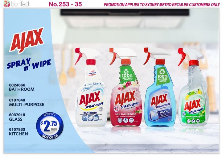
- Products: Cleaning products
- Target audience: B2B Customers
- Color scheme: light blue and white
- Emphasis on cleanliness and place to use
- I spent a lot of time looking for a background image of a white kitchen with a marble top because I wanted to make a reflective effect so this ad would send a message to the client that this product can make the home very clean and shiny
- Blur the kitchen background to make the main product more visible
- Information is placed on the left, and a light blue transparent background adds coherence and also looks like a piece of glass
A.D.S
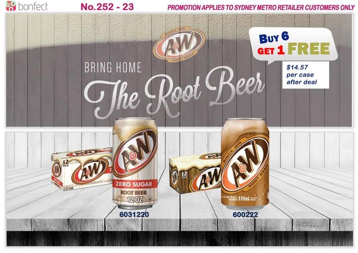
- Products: Root beer & Zero sugar Root beer
- Target audience: B2B Customers
- Color scheme: White and brown
- Root Beer
- Root beer is a traditional drink with a unique taste, thick overhead and rich foam. So I looked for a wooden outdoor background and mixed the walls with a thick foam image to remind the viewer of its selling point.
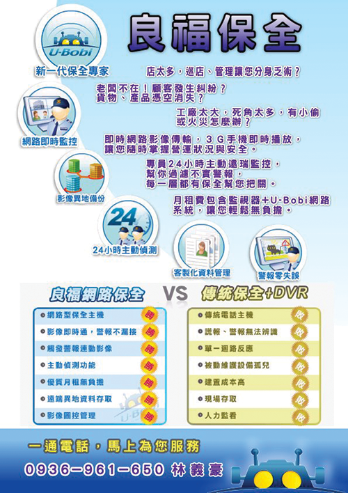
F.L.Y.E.R
- Flyer purpose: promote shop alarm system to target user
- Target audience: shop owners
- Color scheme: Mainly blue represent the company
- First part: Introduction message emphasize by purple with white boarder attract user read the problems and risks of their shop prioity
- Second part: Six main icons tell the advantages of the alarm system
- Third part: Comparation of our company with the tranditional companies (distinct with colors and dot points)
- Forth part: a slogan lead user to call the salesperson for enquire
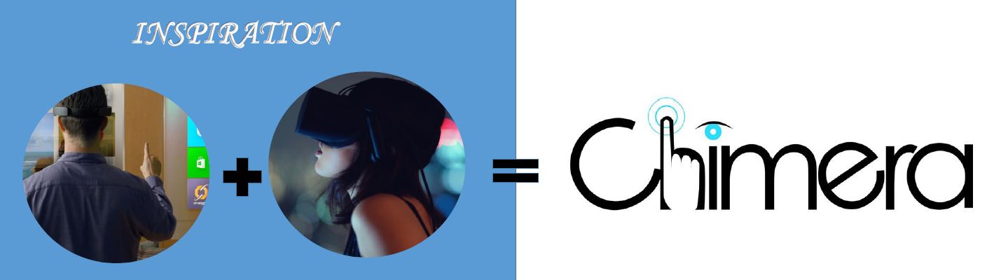
L.O.G.O
- Chimera specializes in a head mounted mixed reality display. They aim to seamlessly blend 3D computer generated graphics with real time space that user can interact with, without the need for using handheld devices.
- The images are metaphor the sense of touch and the sense of sight, which is how we interact with mixed reality
- The feature of this logo is a combination of letterform and objects with hand and eye.
- Character C and e slightly rotated in order to reduce the feeling of too general and boring
- This logo is using a monotone achromatic colour scheme which consists of only neutral colours ranging from black to white. A scheme like this can be efficient, high contrast, but it can very easily look boring.
- In this logo, light blue is also associated with high technology and coolest. Light blue is a bright colour can also create high contrast with black colour.
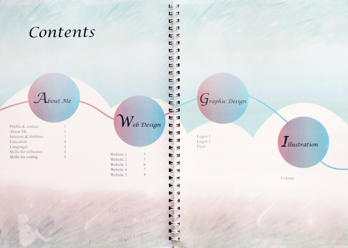
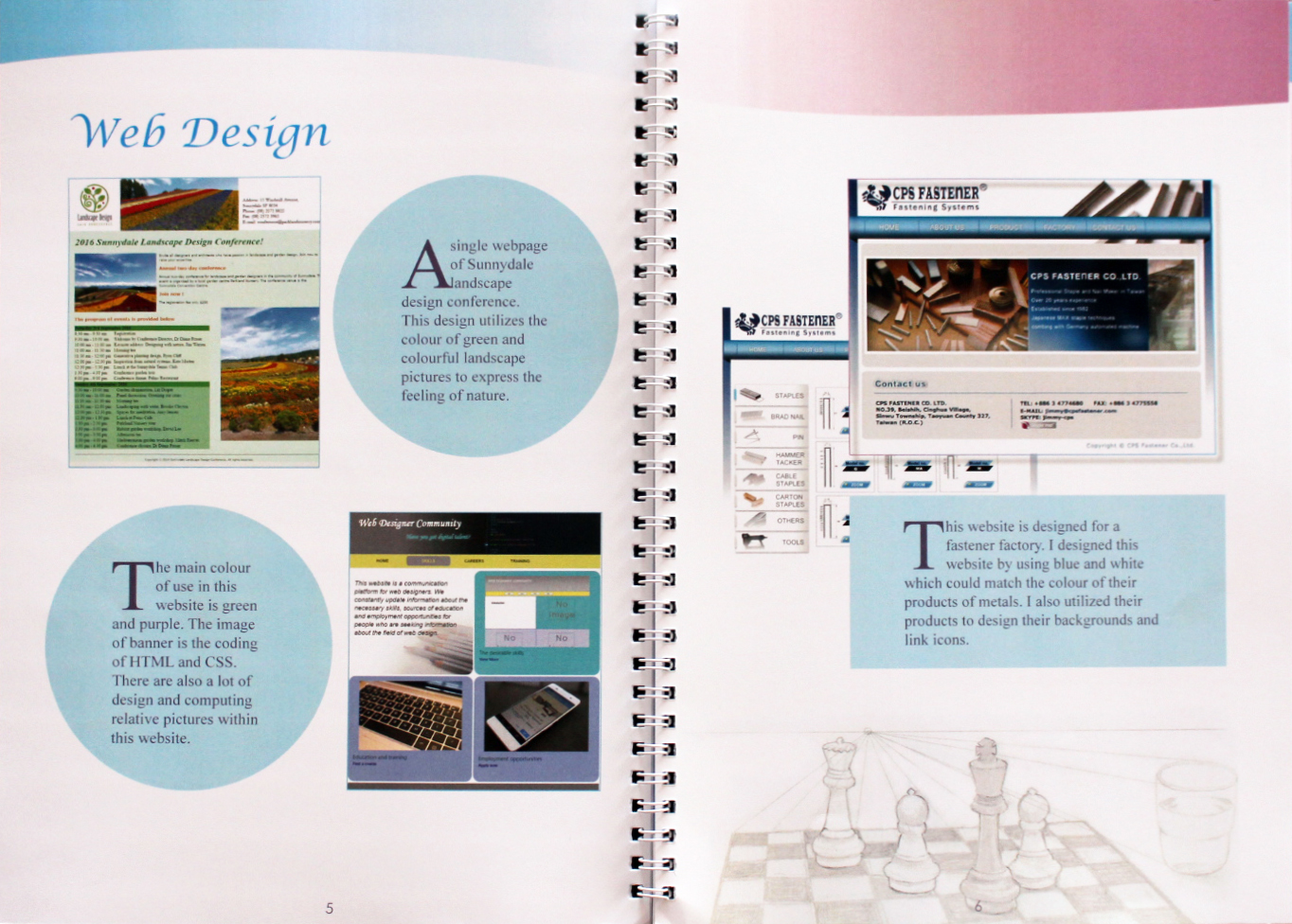
E.D.I.T.O.R.I.A.L
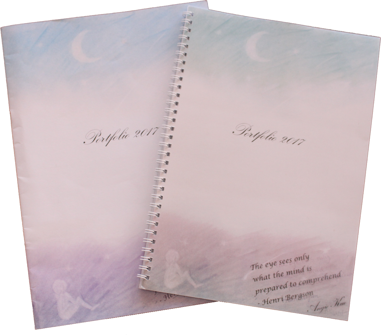
- This is an assessment of my first year of uni is my portfolio in 2017. Aim to practice more about editing and printing
- Color scheme: color gradient from light blue represent the sky with the meaning of with depth and stability and purple represent the land associated with wisdom, dignity, independence, creativity, mystery and magic.
- I use my pervious hand-drawing artwork - 'A girl looking up to the sky' as the cover background, I wish to express my expectations for the future
- The Script typefaces used for the cover page and title and inner pages headings, because I want to express a sense of elegant
- The background of the index page continues to link with sky and cloud to introduce the contents of my portfolio to increase consistency
- The top of the content pages use gradient from blue to pink for consistency but not using the previous background anymore, using white background to outstanding the main contents
- Every page background has my hand-painted artwork hope to show my other hobby and talent